Always happy to
meet new people!
For general inquiries
hello@lmnop.works
Achter de Dom 14
3512 JP, Utrecht
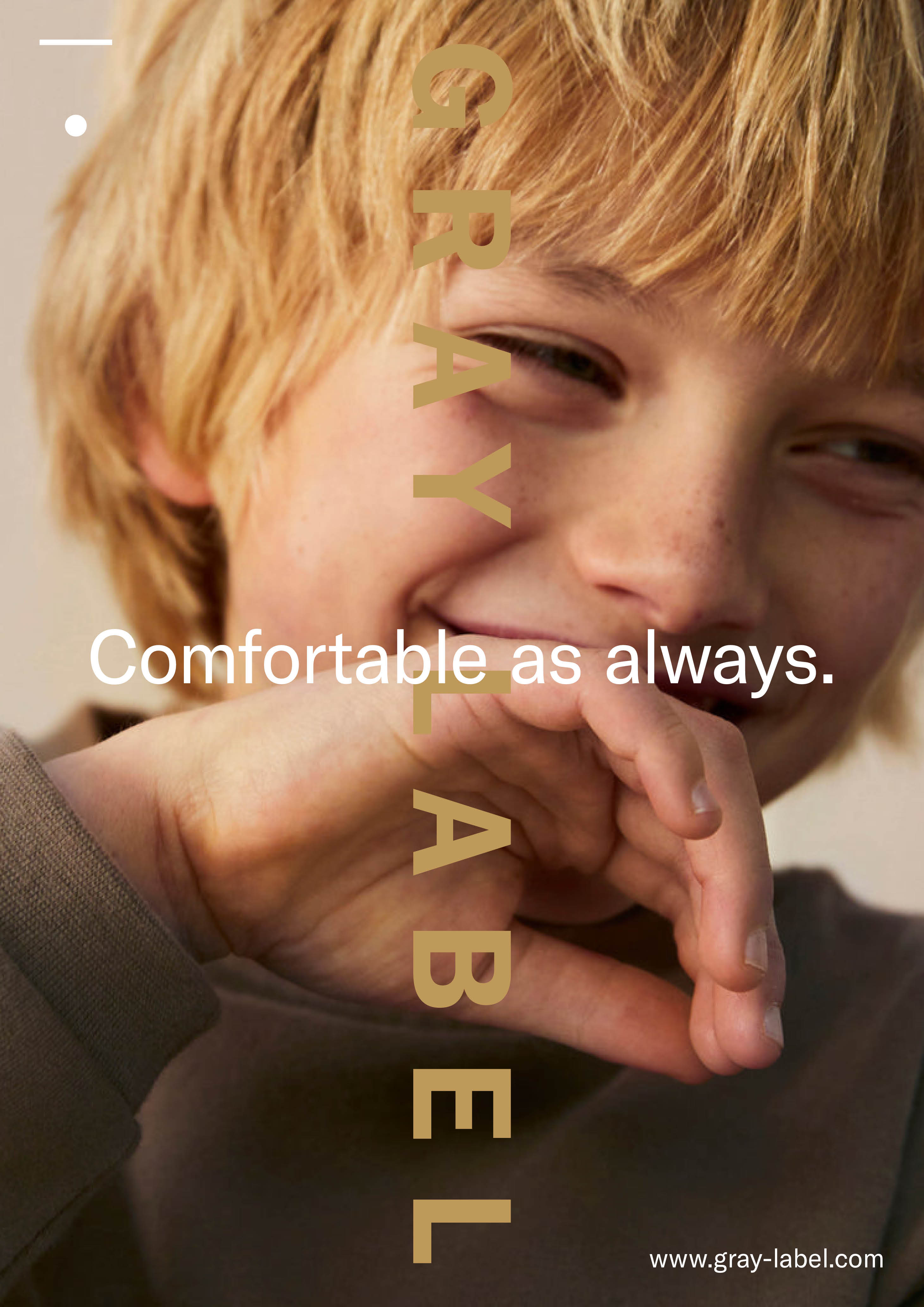
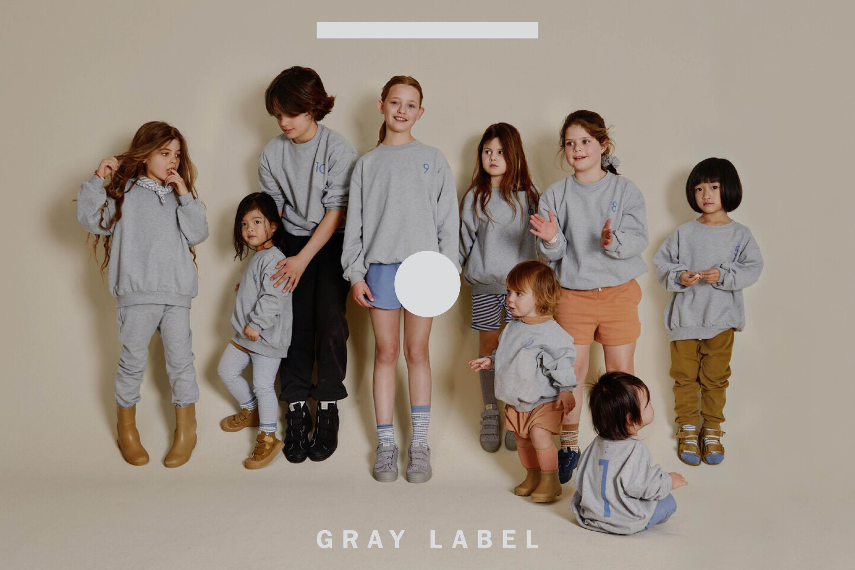
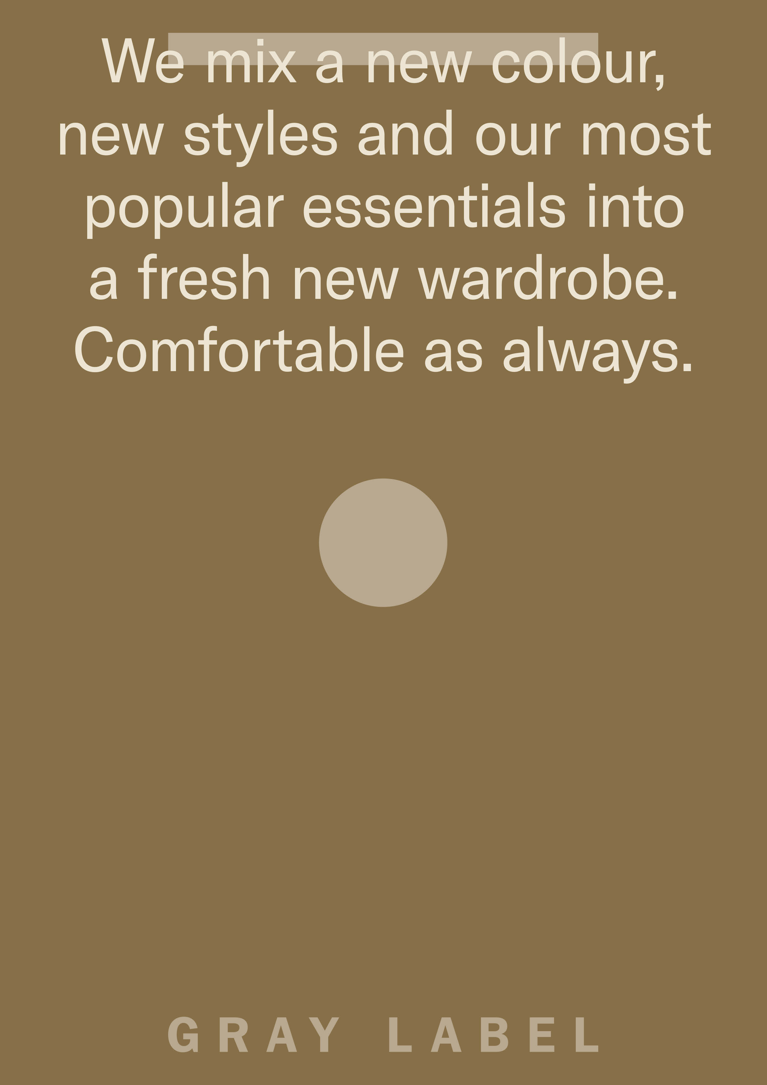
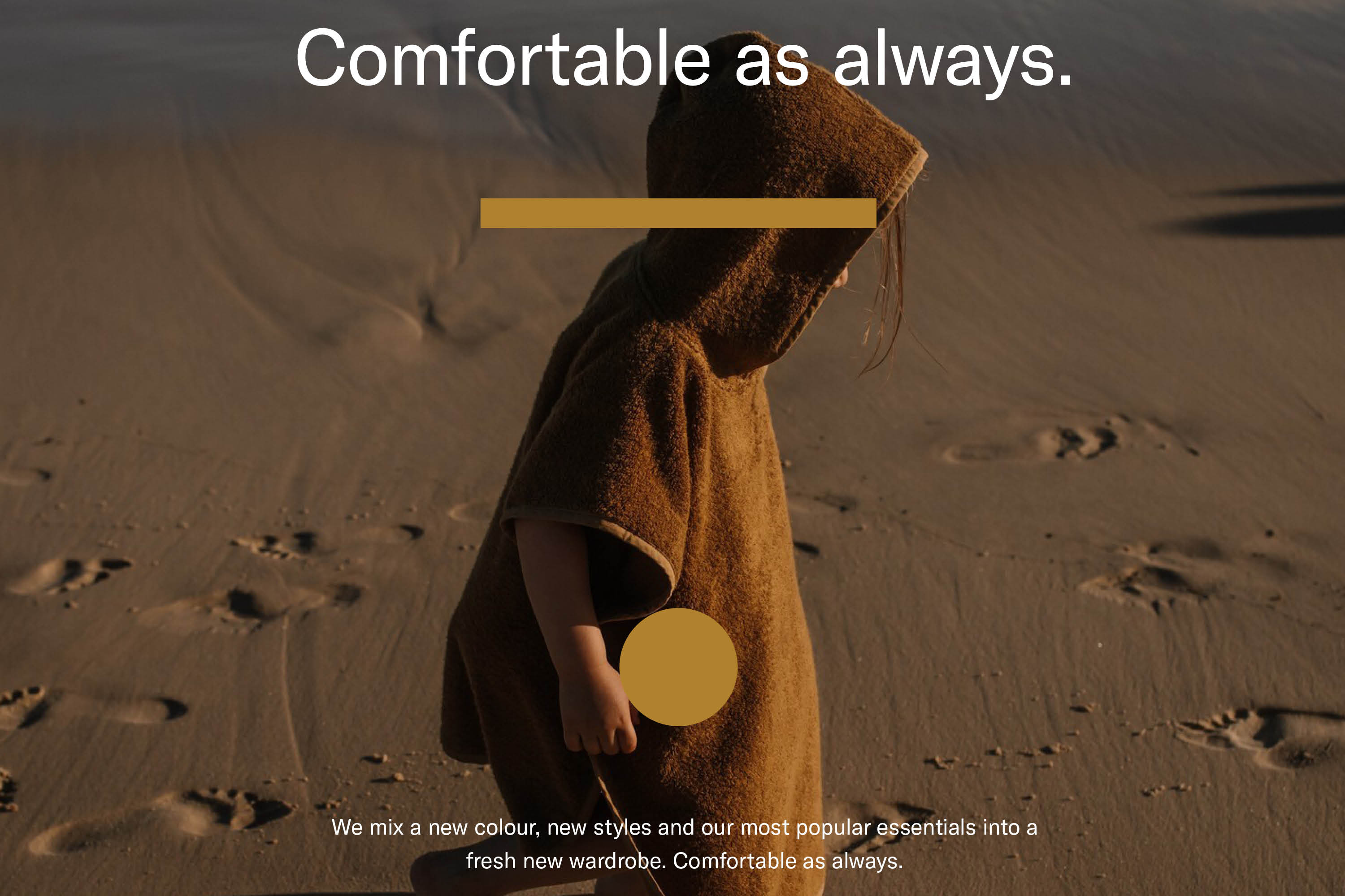
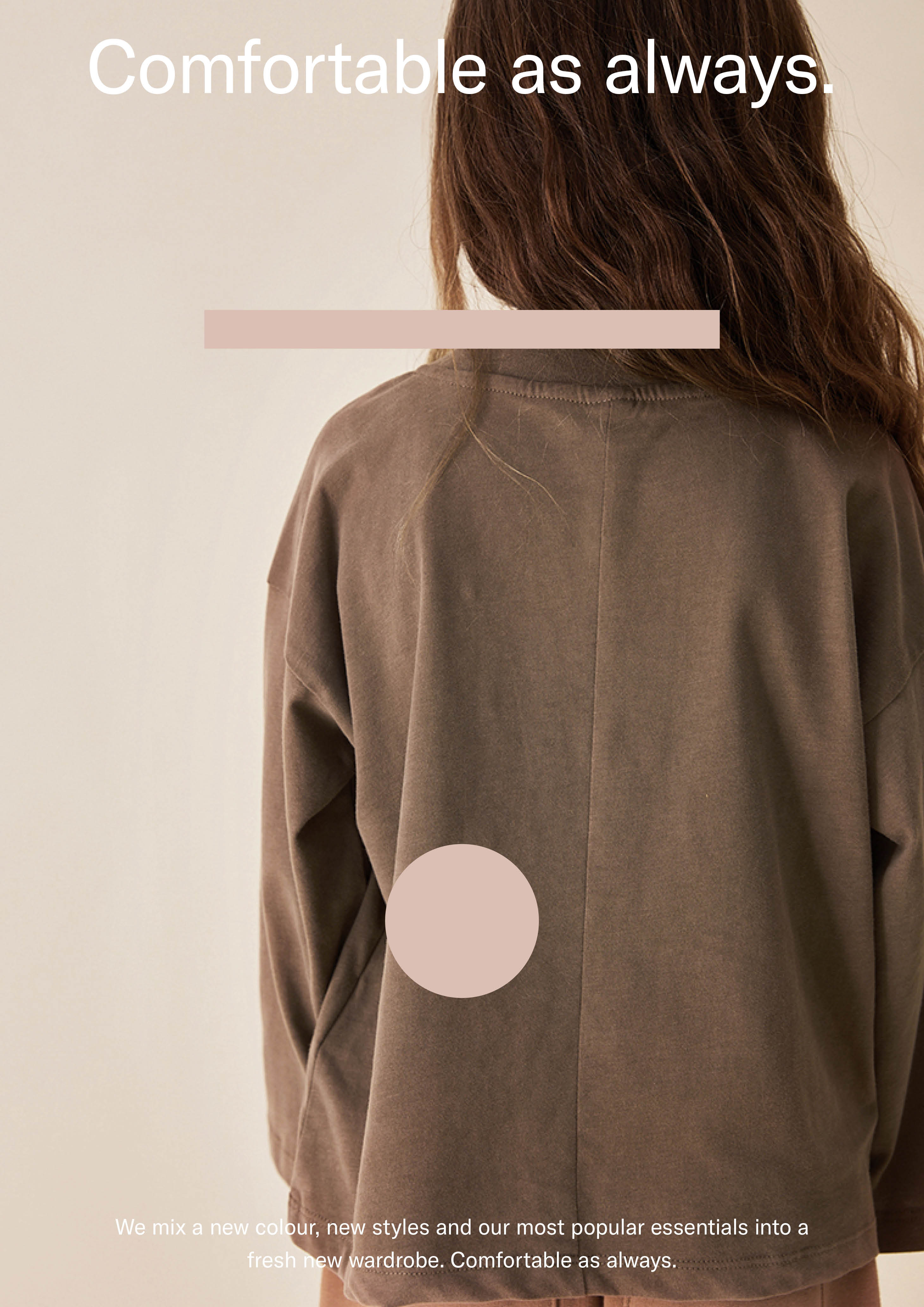
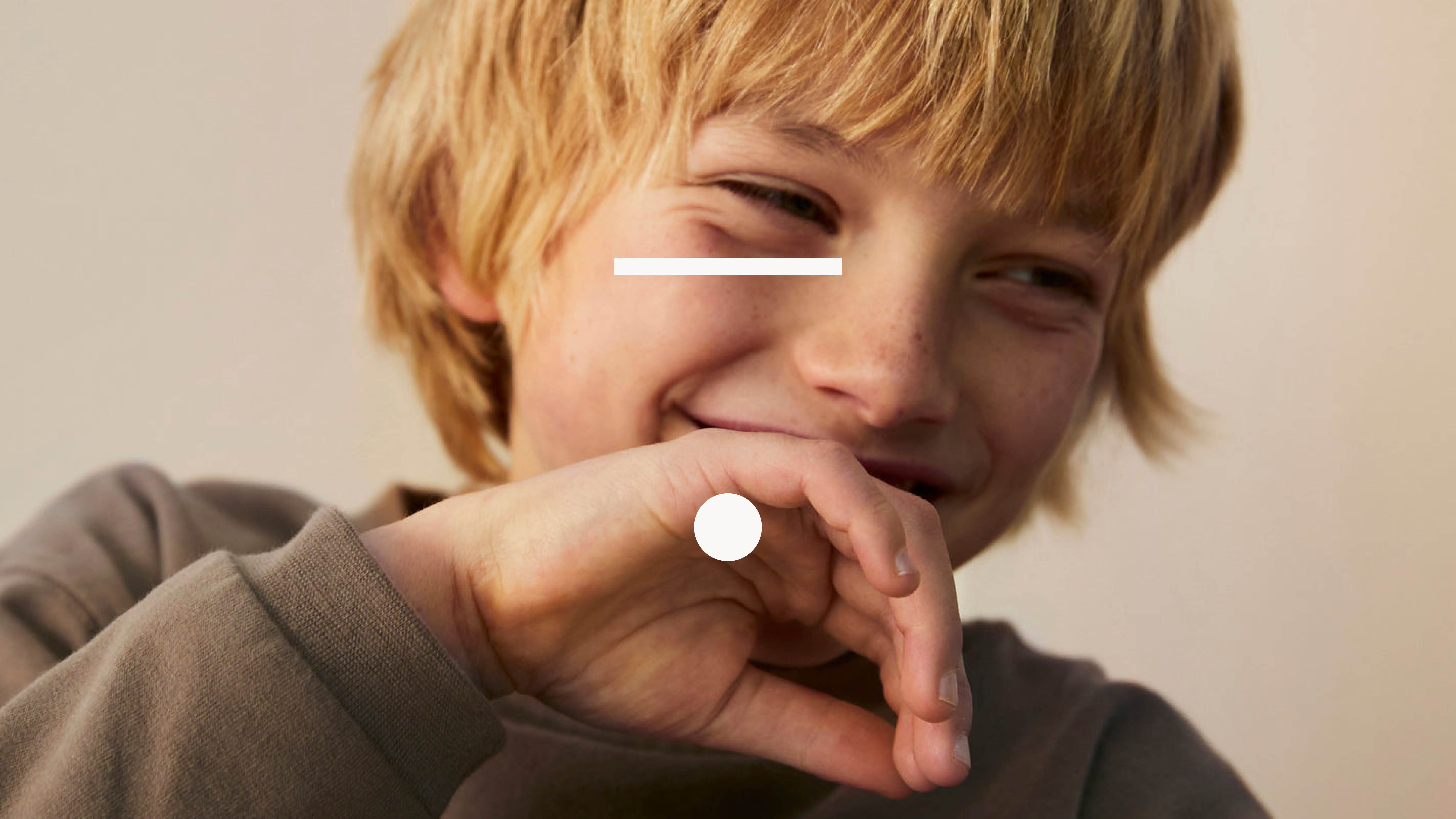
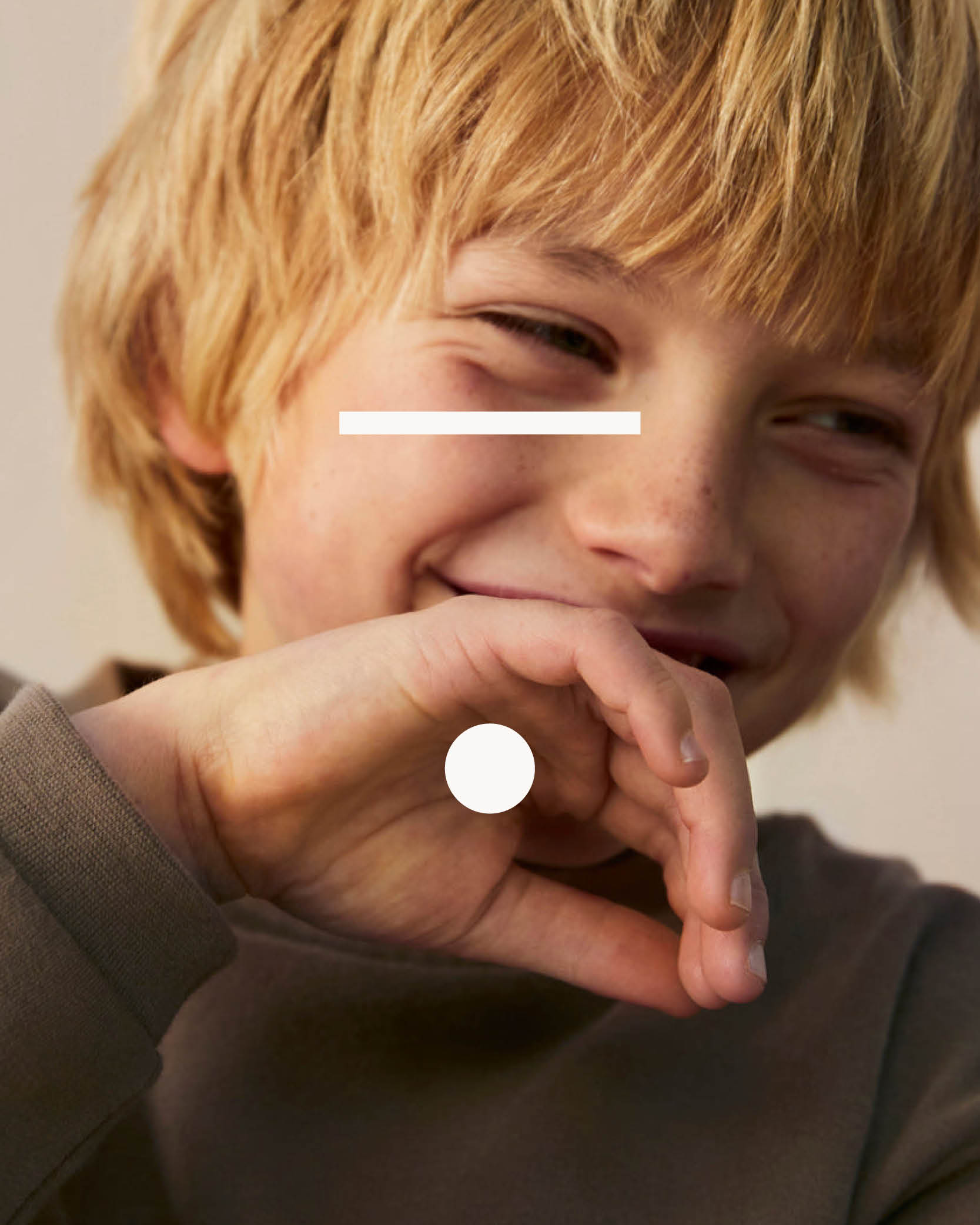
Gray Label creates timeless, minimalistic and comfortable collections in which children can be their true selves. Soft-tone coloured essentials that are easy to mix and match, made from the best organic cotton available. Gray Label has been a staple since 2011 and reached out to rethink their graphic identity.
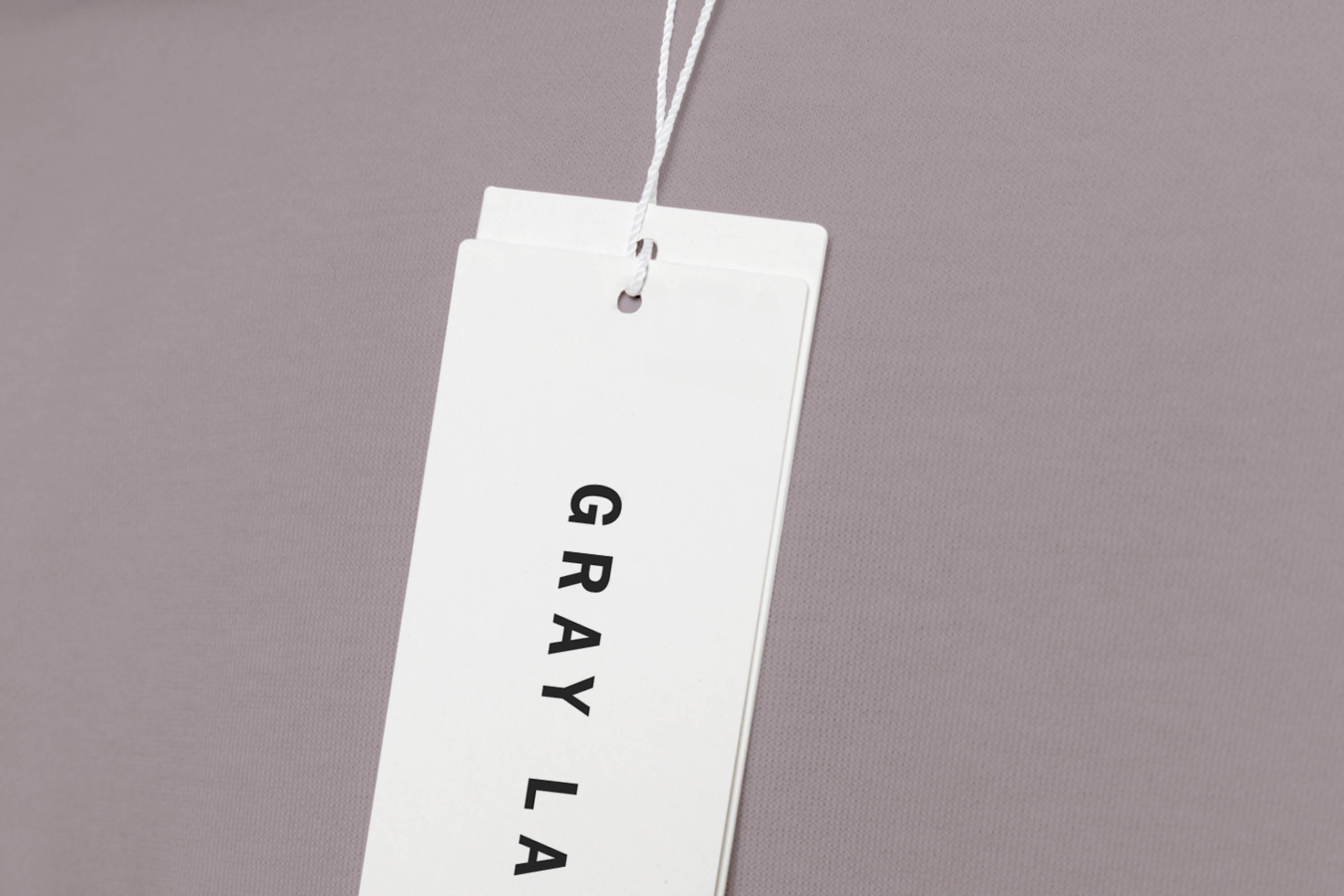
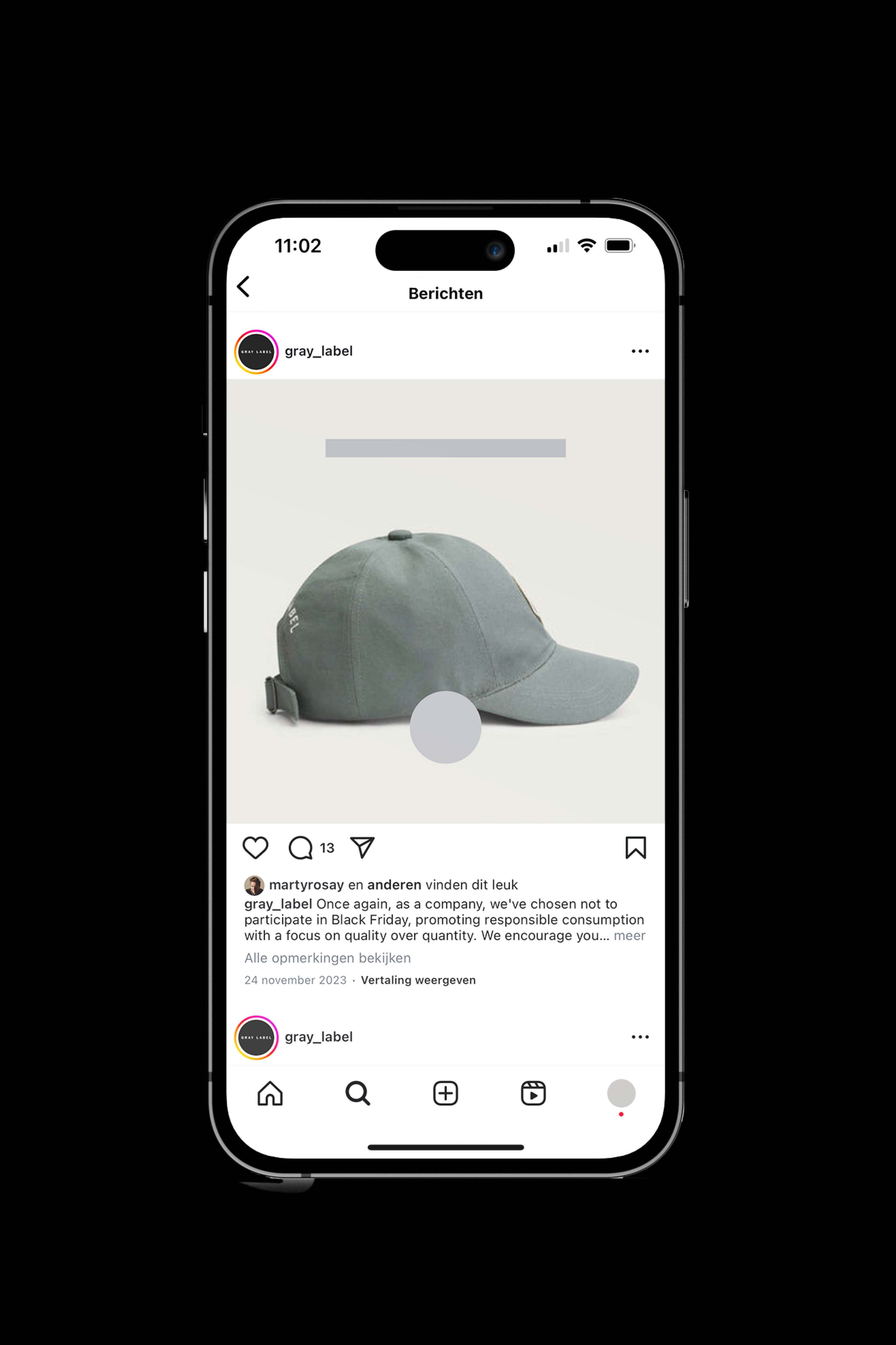
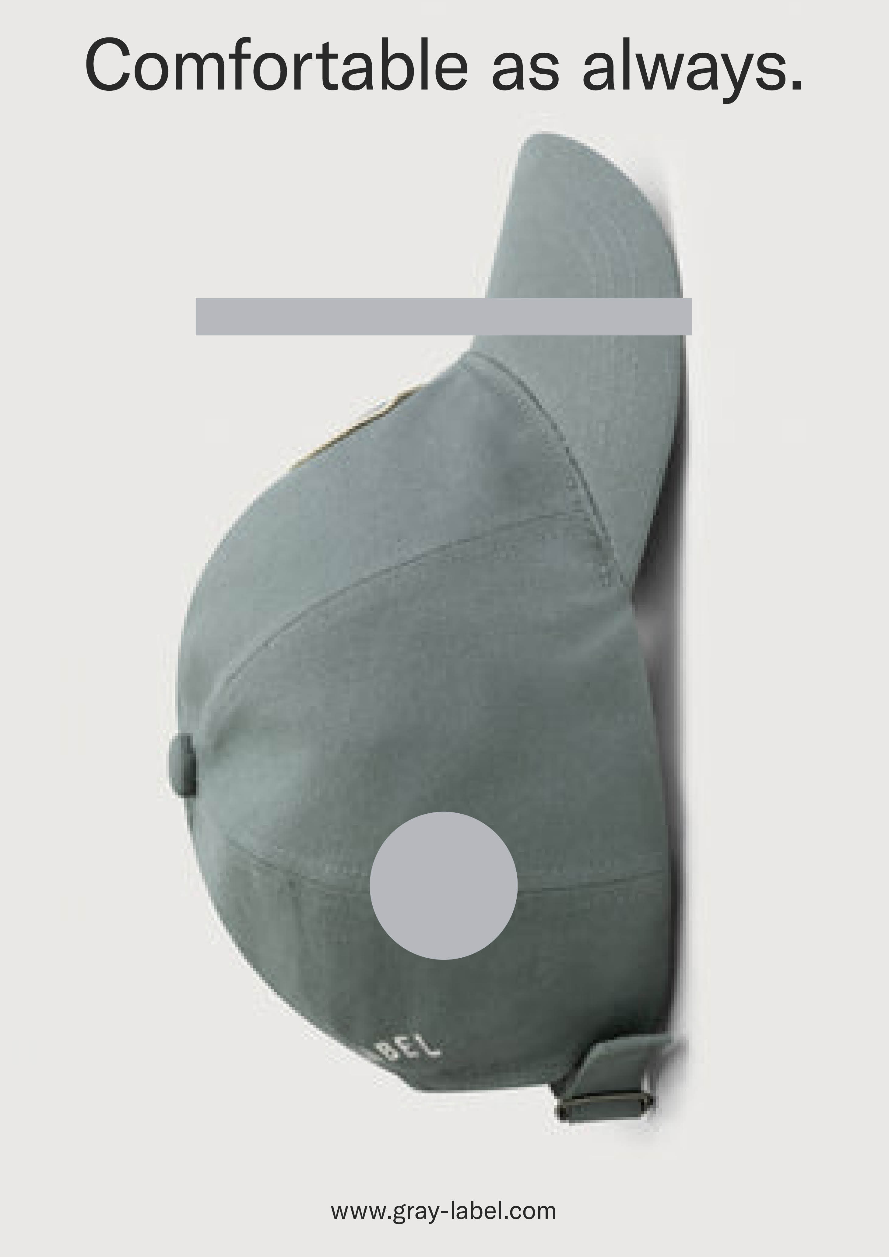
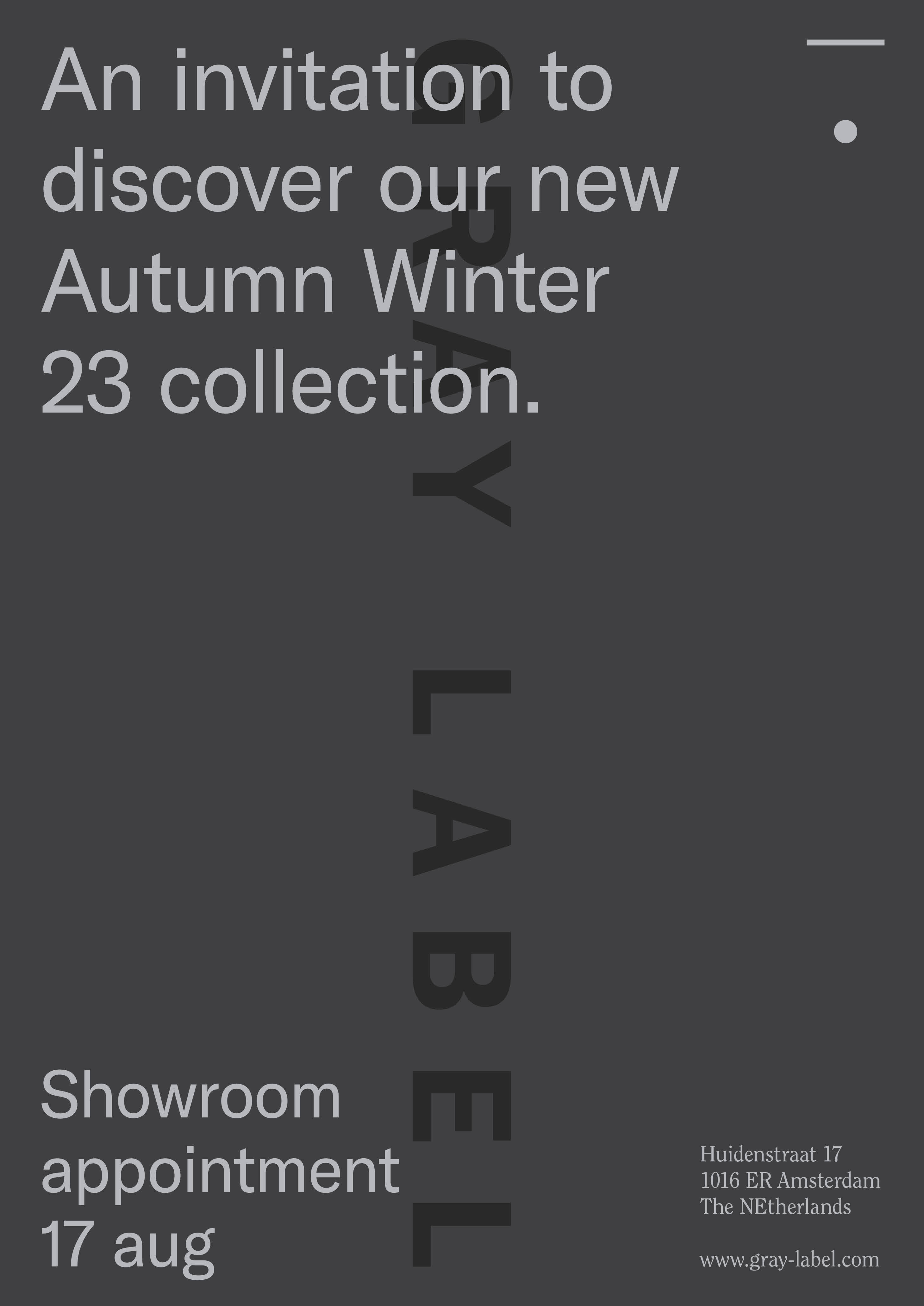
Their existing graphic identity had some very strong elements like their bold typeface and simple 'dot-stripe' icon. But these items were cluttered by many different elements and ideas. So our approach was simple. Go back to the core. We put more emphasis on the brands actual name/wordmark and used the 'dot-stripe' icon as a more outspoken emblem.
We paired this with a contemporary and timeless new typeface. And re-used Gray Label's existing colour palette, adding different tones of each colour that gives the opportunity to create ton sur ton colour combinations. Resembling the brands soft approach to textiles and colour.
A simple but essential redefinition of an already solid brand identity.