Always happy to
meet new people!
For general inquiries
hello@lmnop.works
Achter de Dom 14
3512 JP, Utrecht


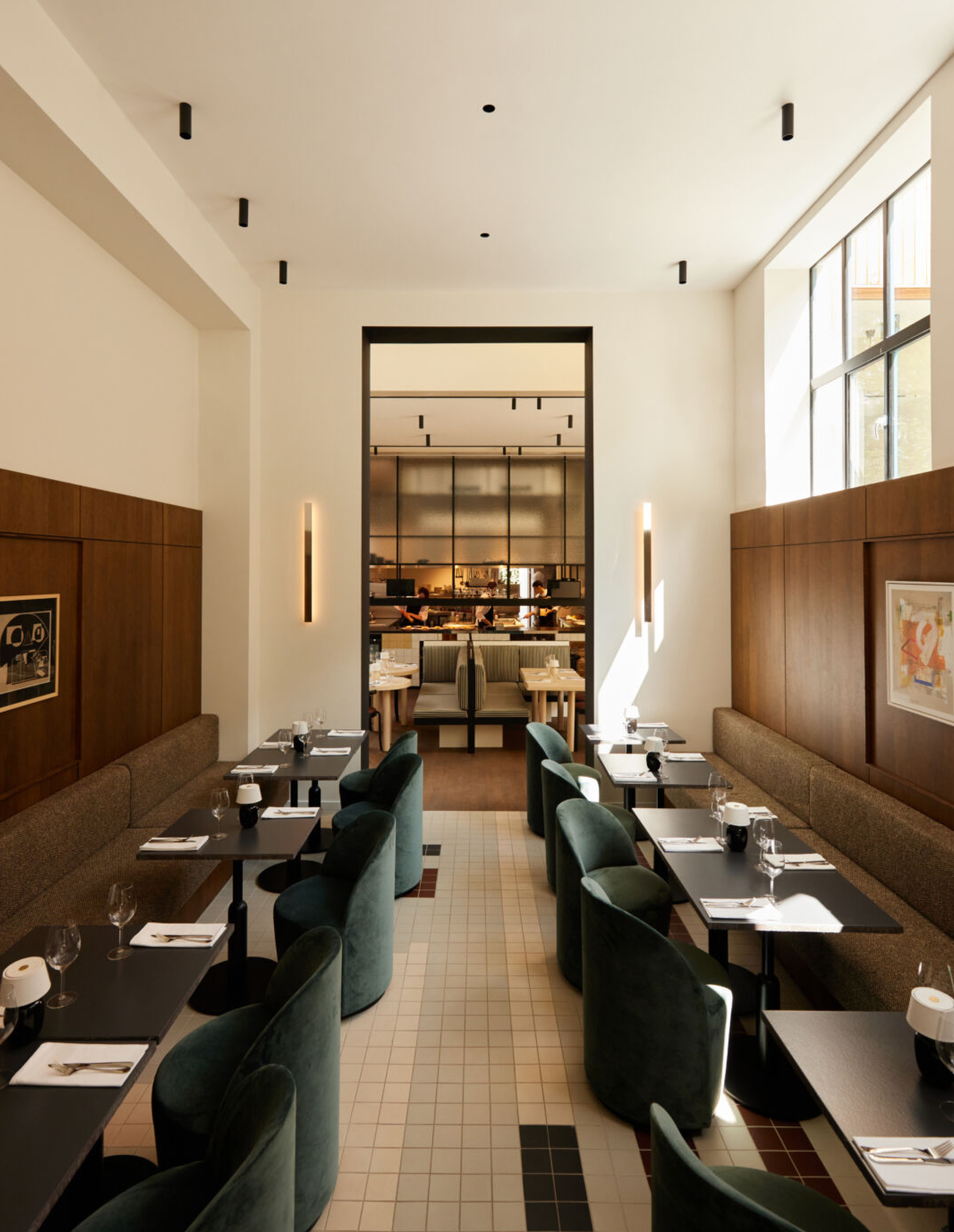
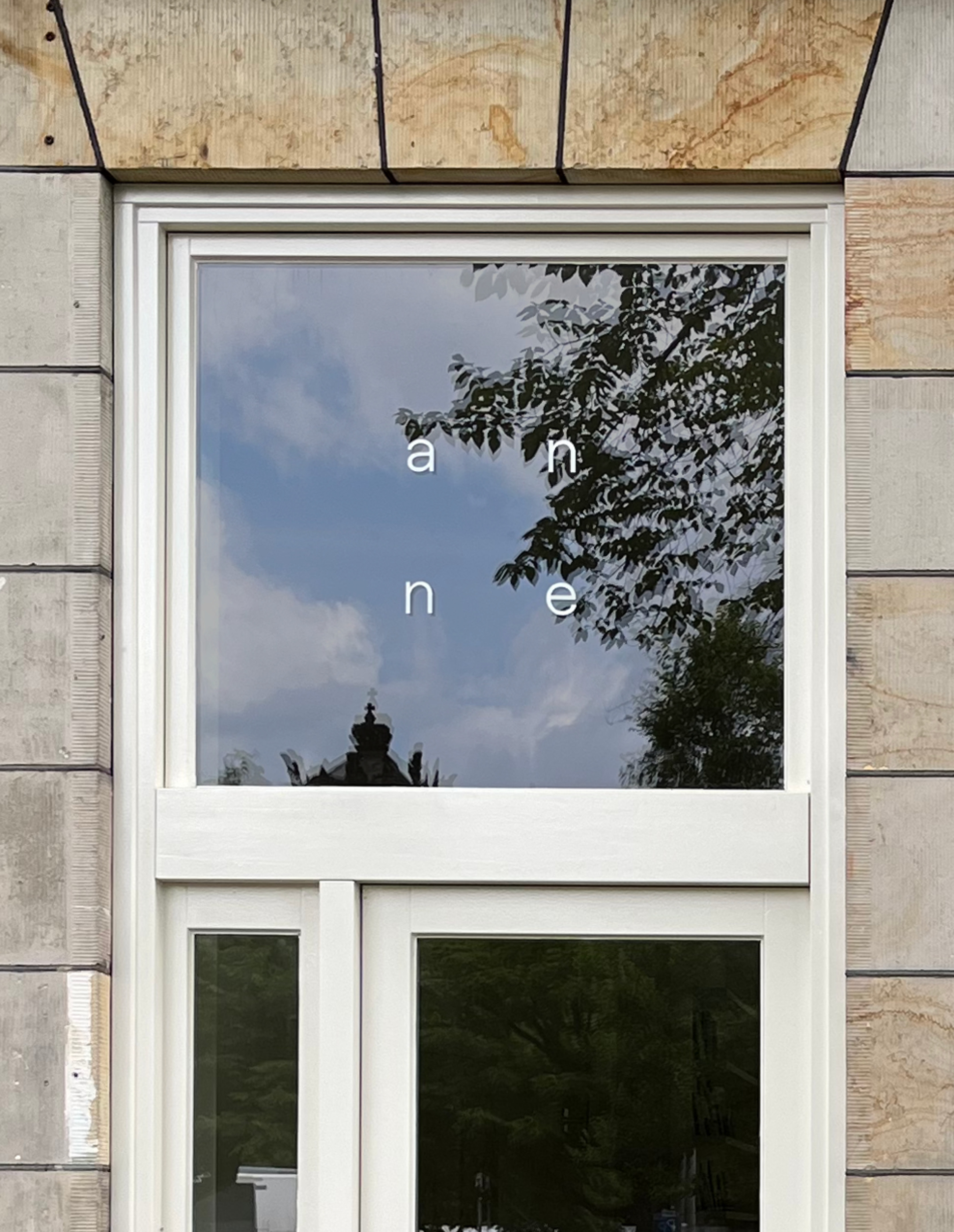
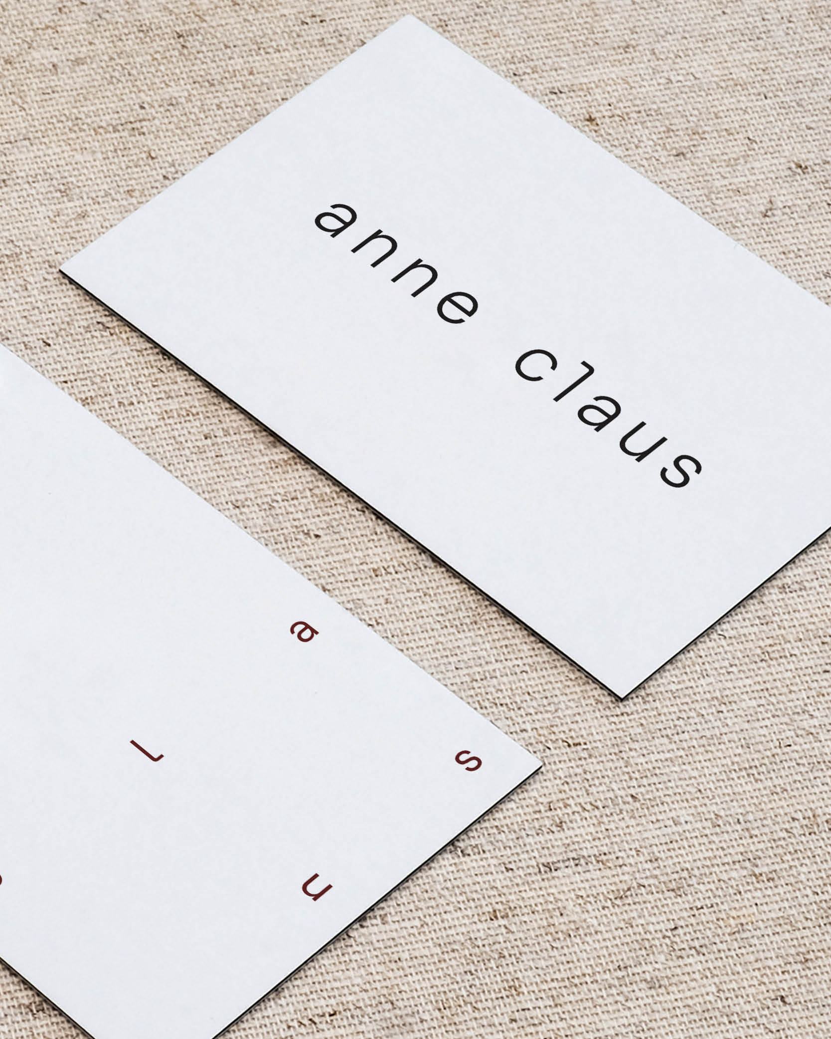
Anne Claus is an Amsterdam based interior design studio working on a variety of projects ranging from residential homes to stores, restaurants and hotels. With an outdated visual identity and a growing portfolio filled with beautiful projects the brand was in need of a fresh new redesign of their visual identity. It needed to reflect the elegant design approach of Anne while also showing a sharp and technical side of the business.
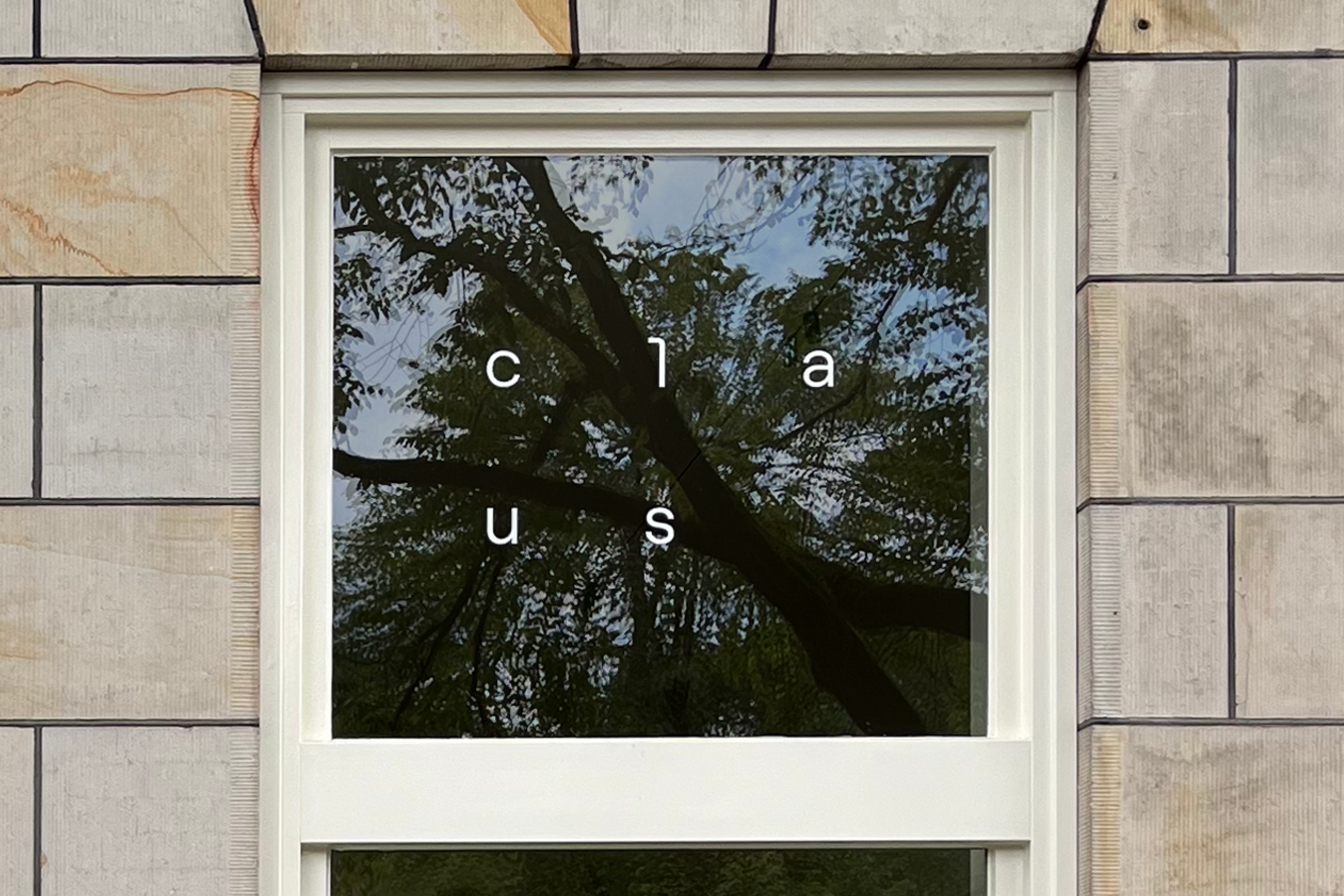
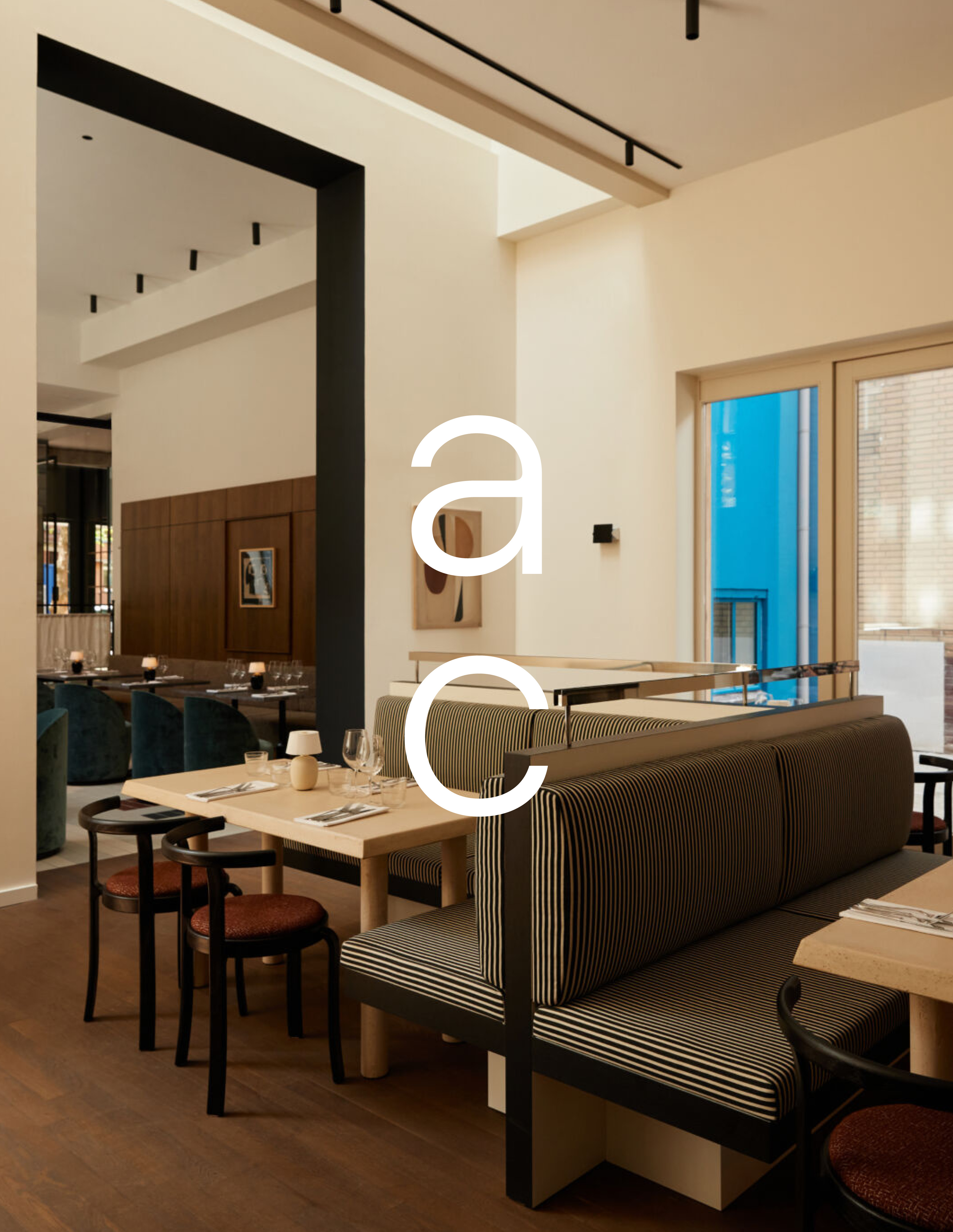
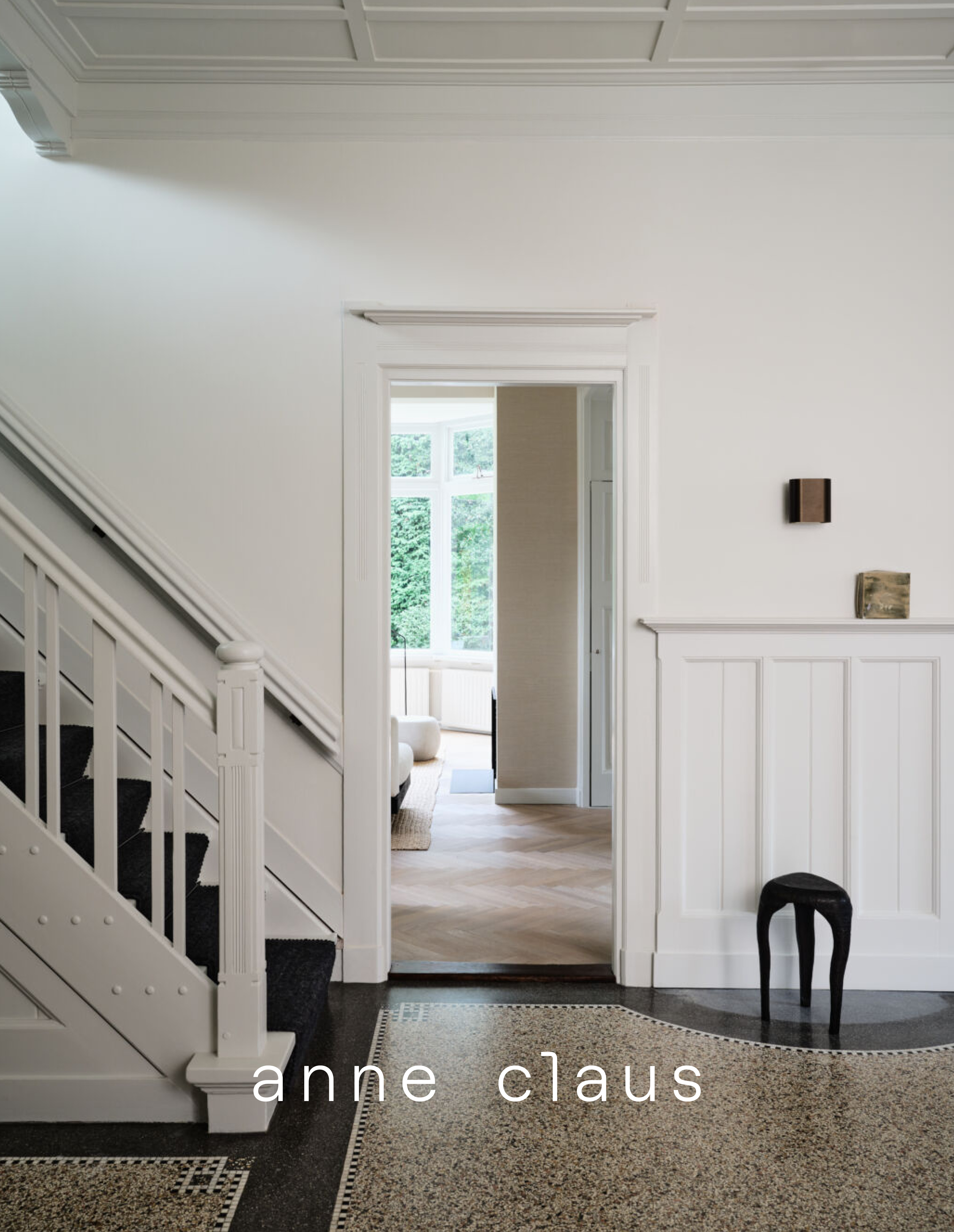
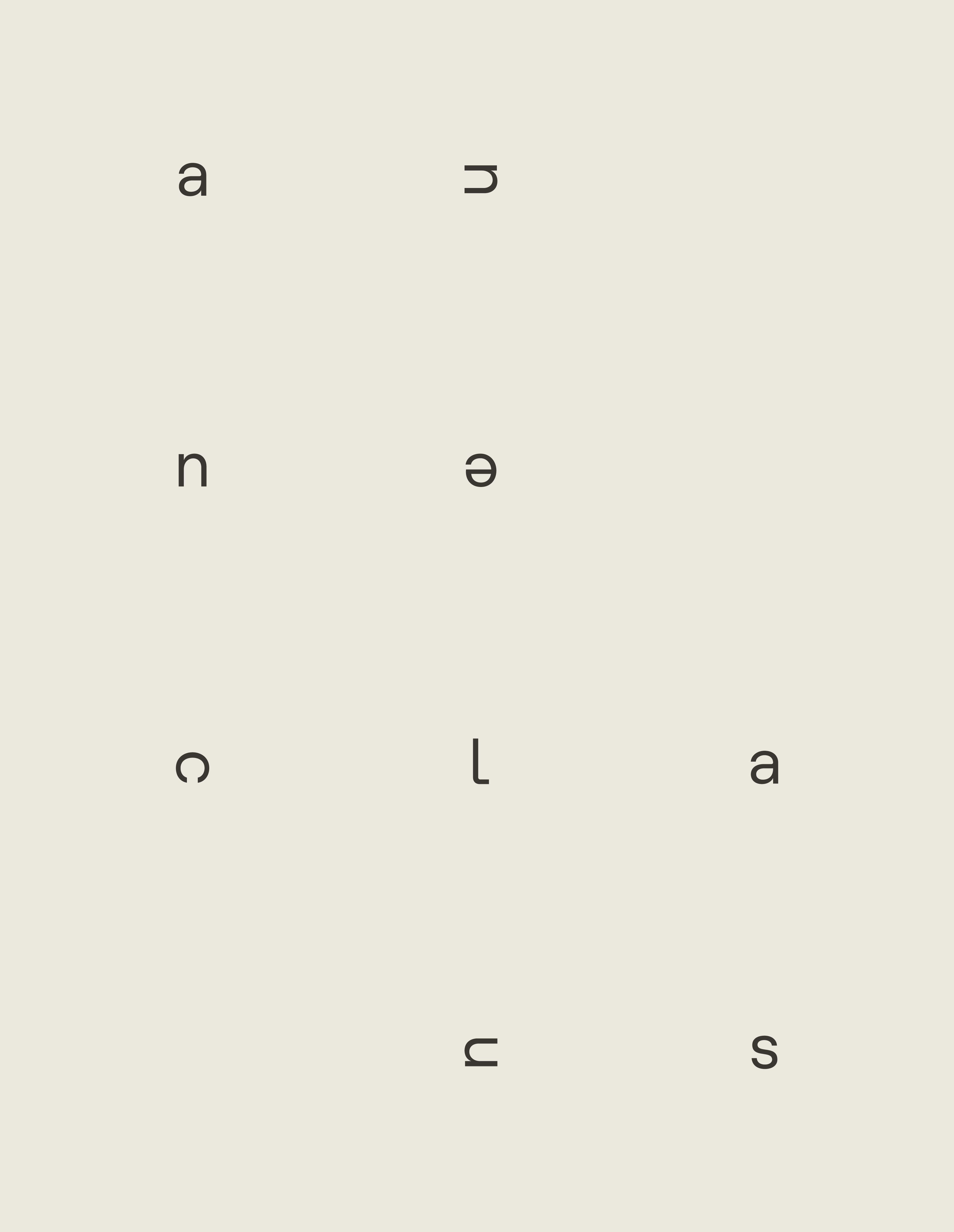
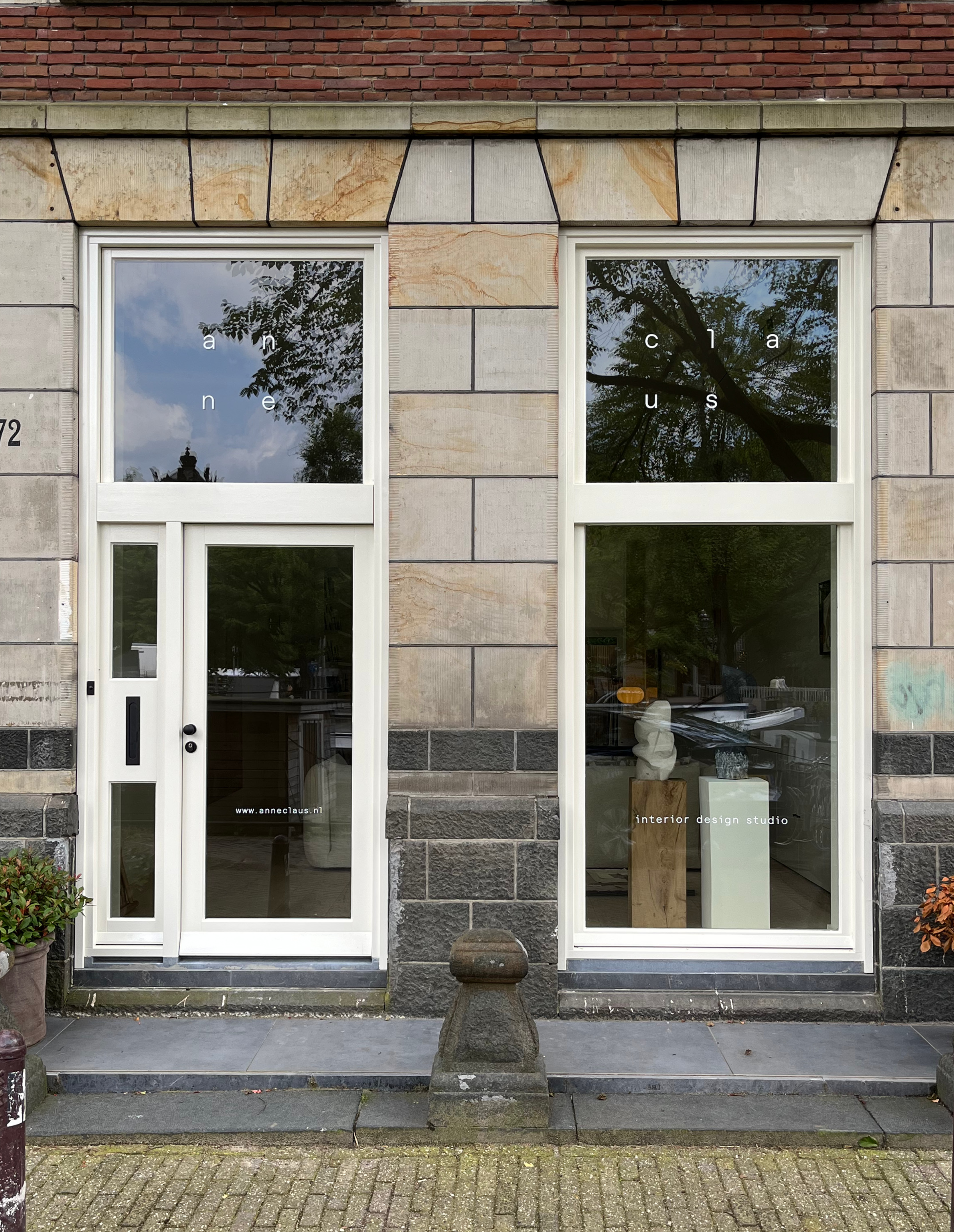
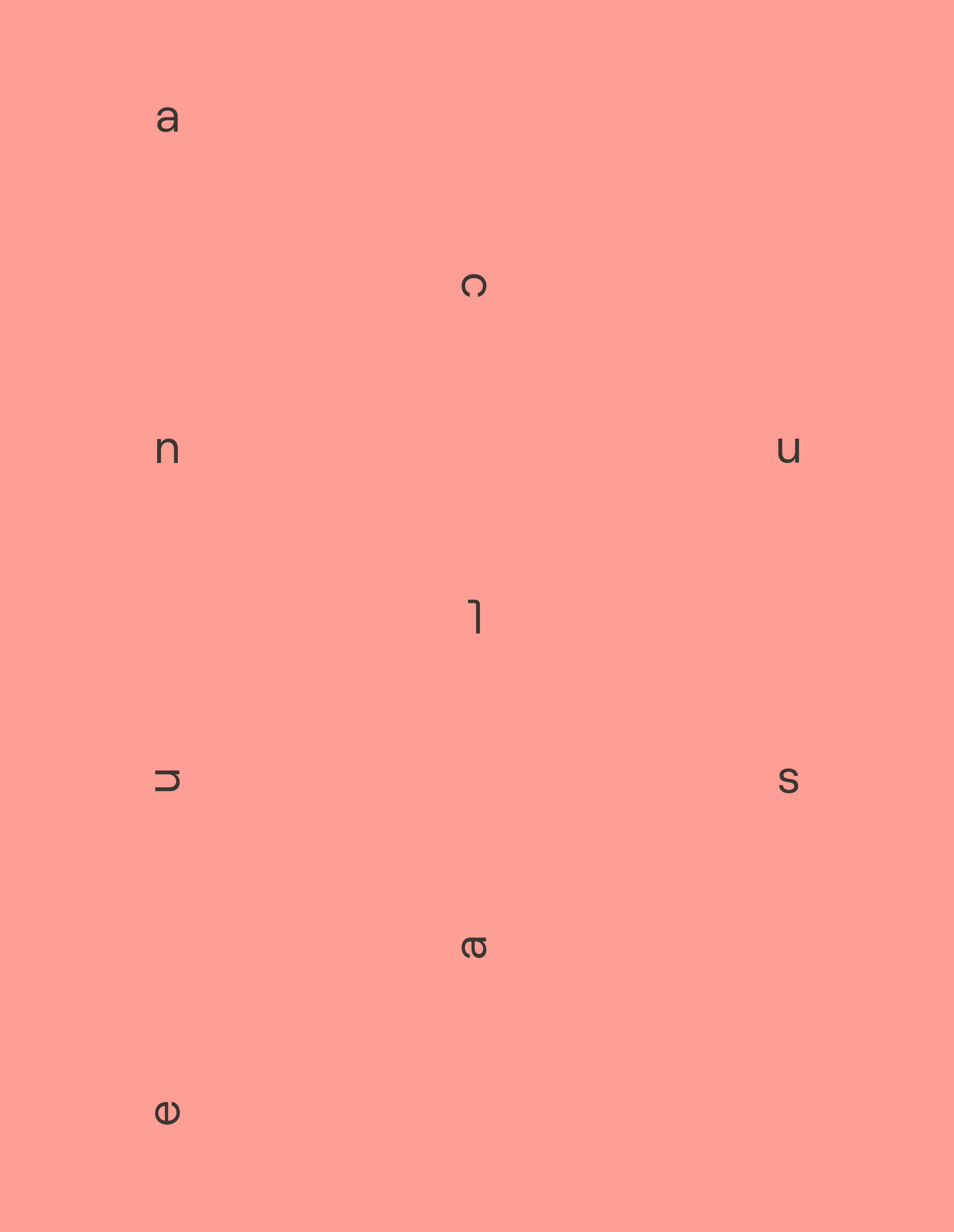
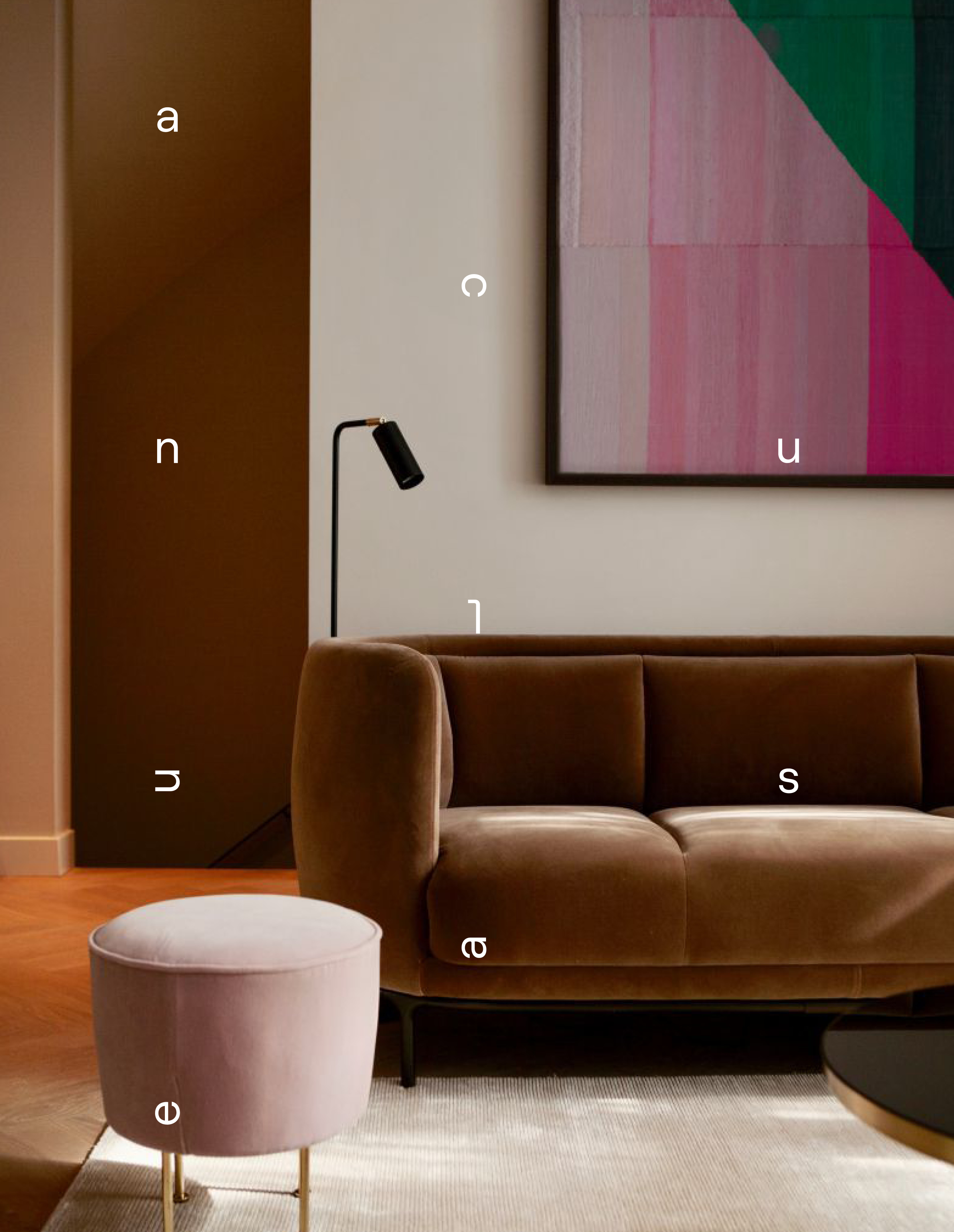
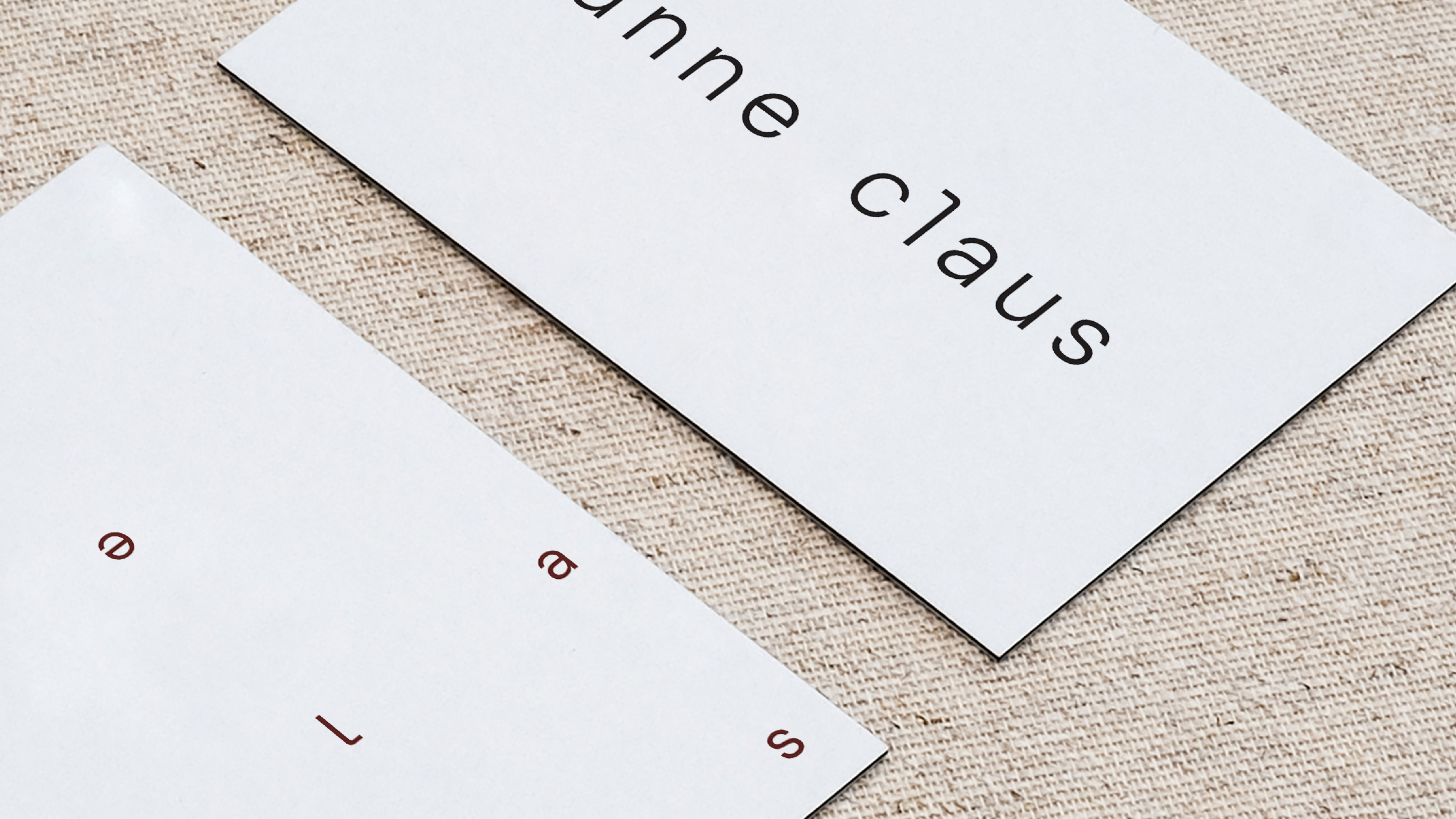
We started with typography as a base. A modern, monospace typeface sets the tone. We used the letters of Anne's full name to create spacious layouts resembling blueprints, rooms or interior setups. The resulting graphics are supported by a stripped back word mark. No tips and tricks here. As the brand 'Anne Claus' lends it's name from Anne herself we thought it would be fitting to also use initials as a secudary logo or icon. A small hint to the person behind the brand.
The entire identity is as subtle as Anne Claus is. Timeless, well constructed, designs and attention to detail are more important then loud interventions.
